Subtotal: $
Checkout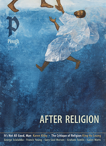
-

Charting the Future of Pro-Life
-
Letters from Readers
-
Home in My Heart
-
Remembering Alice von Hildebrand
-
Sadhu Sundar Singh
-
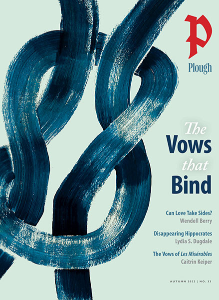
Covering the Cover: The Vows That Bind
-
The Day No One Would Say the Nazis Were Bad
-
John Wayne, The Quiet Man
-
No Promises
-
Word Is Bond
-
Bring Back Hippocrates
-
The Dance of Devotion
-
Victor Hugo’s Masterpiece of Impossibility
-
A Vow Will Keep You
-
A Broken but Faithful Marriage
-
Can Love Take Sides?
-
A Defense of Vows
-
Why I Chose Poverty
-
Demystifying Chastity
-
The Adventure of Obedience
-
Vows of Baptism
-
Hutterite Ten Points of Baptism
-
The One Who Promises
-
Vows in Brief
-
The Raceless Gospel
-
Poem: “Blessing the Bells”
-
Poem: “Autumn in Chrysalis-Time”
-
Tiny Knights
-
Editors’ Picks: What Your Food Ate
-
Editors’ Picks: Untrustworthy
-
Editors’ Picks: The Last White Man


Retooling the Plough
We’re giving our logo a bit of an edge. Here’s why.
By Clare Stober
August 30, 2022
Available languages: Español
Next Article:
Explore Other Articles:


0
Comments
0
Comments
Post a Comment
Did you notice anything different on the front cover of the latest Plough Quarterly? If so, you’ve caught our new logo, created to hold its own in any corner, while giving the artwork its due. Don’t worry, it is not heralding some shift in our core beliefs. If anything, this design move has taken us closer to our own roots.
Plough started in Germany in 1920 as a biweekly magazine, Das neue Werk (The New Work), published by the intentional community now known as the Bruderhof. From the start, the editors had a penchant for agricultural imagery; early publications included Der Pflug (The Plough) and Junge Saat (Young Seed). Already in 1917, founding editor Eberhard Arnold had written, in his previous post as editor of Die Furche (The Furrow):
Only where the plow of God has tilled our lives can sowing bear fruit. An enduring deepening of the interior life can be brought about only through the plowing of repentance. Therefore our main task is to work for that spiritual revolution and re-evaluation which leads to metanoia – the fundamental transformation of mind and heart.
And that’s what this small community worked to do, publishing books as well as the magazine, such as a volume on the early church and an in-depth series of Quellen, “source books” of Christian writings from earlier centuries. These were no closed-door efforts run by an editorial team; the whole community could be found reading the drafts aloud while sorting and preparing potatoes for the next day’s meal, a lively discussion flying around with the peelings.
One can imagine Else von Hollander, one of three founding Bruderhof members and an artist with a gift for layout and lettering, working late on a book cover design. Perhaps it was she who first chose the bold typeface that announced some of our titles then, and has come full circle to introduce our magazine now. We know that in its earliest days, the publishing house established a relationship with Rudolf Koch, a leading German designer still famous today for creating a number of typefaces, one of which is prosaically named Fette Deutsche Schrift (Fat German Font).
Eberhard, Else, and others spent long days on the road speaking at conferences, calling on contributors, and raising awareness for their publishing efforts and communal venture. The urgency grew under the shadow of the Third Reich, and their efforts did not go unnoticed.
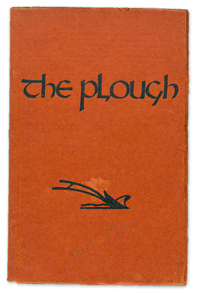
Cover of the March 1938 issue of The Plough showing our previous logo (1938-2022)
In 1936, facing increasing harassment by the Gestapo, the community shipped its printing press to England. In 1938, only a year after the German publishing house and its supporting Bruderhof community were shuttered by an SS raid, the magazine appeared in English under the name The Plough.
Apart from being the name of every other British and Irish pub, the name Plough had additional resonance in the magazine’s new home. In the British Isles, the constellation Ursa Major (known to North Americans as the Big Dipper) is the Plough, guiding the farmer starting early or working late. And in British literature, from the fourteenth-century Piers Plowman to John Masefield’s 1911 poem “The Everlasting Mercy,” Christ himself guides the blade: “O ploughman of the sinner’s soul. / O Jesus, drive the coulter deep / To plough my living man from sleep.”
The Plough’s logo must have been sketched by a member of the new community in the Cotswolds, where dozens of English pacifists were joining the German refugees. Shortly afterward, the community was forced to leave England amid wartime panic.
Plough Publishing House has been based in the United States since 1963. In 2013, it moved to new offices at Fox Hill Bruderhof in Walden, New York. A year later it relaunched its flagship quarterly print magazine, featuring the same motif that had appeared on the first 1938 cover.
Two years ago, Plough’s editors and designers agreed that it was time to refresh the design, especially the logo and typography. Now change has come to the cover and website. Our designers have always wished that the word “Plough” and logo didn’t take up a third of the cover; a more compact nameplate would greatly expand the possibilities of art they could use. And as logos go, it’s somewhat spindly – if you have to shrink it down, it doesn’t “hold its space well.”
After much consideration, we agreed that while the name – and its British spelling – weren’t up for a change, the old hand-guided plow was. Design challenges aside, it’s less recognizable to readers than it was in 1938. (Those of us who aren’t farmers might not even know that plowing has fallen out of favor!)
Though we are parking the plow, we’re not abandoning our heritage. Poring through our archives and original book covers, I saw the prevalence of Rudolf Koch’s bold Fette Deutsche Schrift and found that my predecessors in the 1920s had purchased this very font – as handset type made of lead. I adapted the uppercase P to create Plough’s new-old logo. To accompany the calligraphic P, I designed a stronger “Plough” wordmark in a contemporary condensed serif font. We’ve combined the two in the new nameplate you can see on the cover of this issue. We hope that it will call out to readers from an array of magazines on a table, or a line of book spines on a shelf, with the bold challenge you have come to expect from Plough, and others have yet to discover.

You have ${x} free ${w} remaining.
This is your last free article this month.
We hope you've enjoyed your free articles.
This article is reserved for subscribers.
Already a subscriber? Sign in
Try 3 months of unlimited access. Start your FREE TRIAL today. Cancel anytime.